
Pebble Time with Michael – Day 11
Yesterday, I discovered my new favorite Pebble Time watch face – Straight. Of course, it’s also Max’s favorite watch face, too!
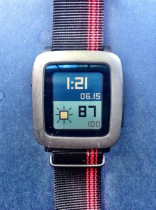
Straight is by the same author as the popular watch face Clear. It’s similar to Clear in its simple but rather elegant design and its ease of viewing in a variety of lighting conditions. It provides me with all of the information I like to have available to me at a single glance. It shows the time, date, current weather conditions, and battery level.
The watch face color schemes and font styles are customizeable, so it’s easy to personalize to your own tastes. Right now I’m regularly switching between the Blue and Red color schemes deciding which I like best. I really like the look of the Blue color scheme (shown in the picture), but the Red scheme goes so well with my new watch band. I’ve settled on the Thick font style for what I think is the best look and certainly most readable information display.
I still occasionally use the Modern watch face when I want to have my Pebble Time looking most like a traditional watch, but most often now have Straight running on my Pebble. In any case, I suggest you give Straight a try on your own Pebble Time and see if you don’t like it just as much as Max and I do!
This is one of the best watch face for pebble